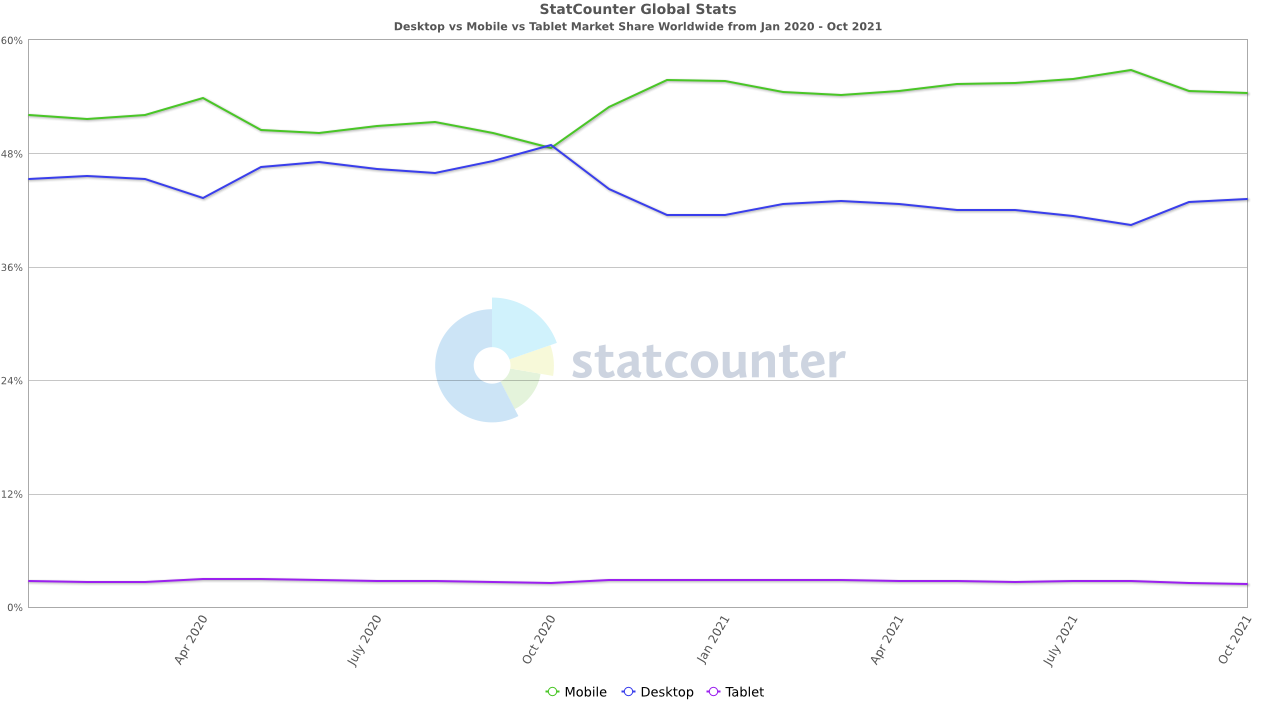
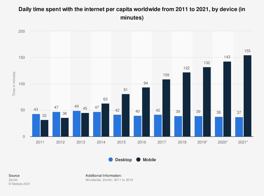
Access to the web has changed dramatically in the last 10 years, with mobile device use now exceeding that of PCs. For this reason there is a great demand for mobile web content.
color-index - the number of colors in the device’s color lookup table
device-aspect-ratio - the device-width/device-height ratio
device-height - the height of the rendering surface
device-width - the width of the rendering surface
height - the height of the display area
width - the width of the display area
orientation - whether the device is in portrait or landscape mode
resolution - the pixel density of the device (in print, this is the dpi of the printer)
The characteristics are used in conditional statements placed 'around' CSS rulesets:
@media all and (max-width: 600px) {
	body {
		// additional styles for mobile
	}
}

@media all and (min-width: 600px) {
	body {
		// additional styles for desktop
	}
}
Logic operators can be used to form complex media query expressions:
Logic operator and:
@media all and (max-width: 600px) and (orientation: portrait) {
	body {
		// additional styles for mobile
	}
}
Logic operator or:
@media all and (min-width: 600px), (orientation: landscape) {
	body {
		// additional styles for desktop
	}
}
what is styled differently?
background colour
image positioning
page breaks
font style
etc.
CSS media breakpoints (sizes at which styles change) can be obtained for currently used devices, e.g. here
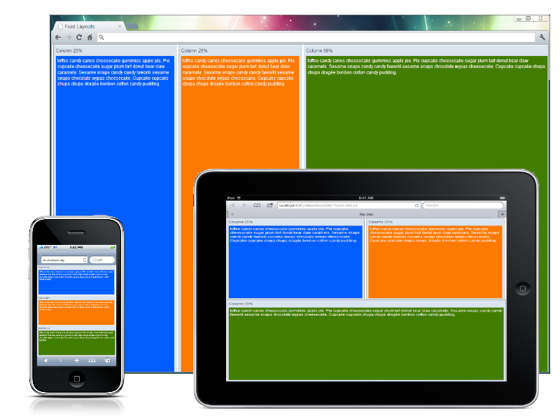
Other than with media queries, responsive design can be achieved with relative sizing of elements (% and em) i.e. elastic layout.
Developing native apps that run on the mobile device's operating system rather than in a browser.
Hybrid development - HTML + CSS + Javascript website 'wrapped' in a native app, e.g. Apache Cordova (often used for cross-platform mobile development)
How are mobile devices different from PCs with browsers?
How are mobile devices different from PCs with browsers?
smaller screens
various resolutions
two different screen orientations (with one primary one)
touch-based input
possibly lower bandwith and network usage allowances
power usage a factor
How are those differences accounted for in web pages?
How are those differences accounted for in web pages?
adjustment when orientation changes
no horizontal scrolling
forms should be mobile-optimised (labels above fields, touchscreen controls etc.)
font should be readable
offline use should be allowed
power-hungry functions should be avoided
should 'work' on a variety of devices
Mobile App Deployment
Mobile App Deployment
Mobile app deployment is different from web content deployment in that the app is packaged and made available for download in an app store, rather than integrated into a running web server. Even in deployment, there are different rules for different platforms:
IOS – Apple App Store only
Android – Google Play store or other (Google allows open creation of stores e.g. Handango, Amazon App Store for Android); requires signing of apps with developers' certificates
Windows – app is submitted to Windows Phone Dev Centre for approval and deployment is tightly prescribed