-
Elements with more than one class
Elements with more than one class
More than one class can be specified for an element, e.g.:<h1 class="spaced red">My title</h1>
The following style and h1 elements in an HTML document:
...
.spaced { letter-spacing: 1em; }
.red { color: red; }
...
<h1 class="spaced red">My title</h1>
...
will be rendered as follows:
My title
-
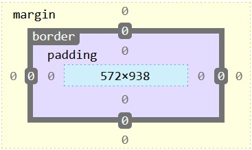
Box model and sizing
-
CSS for layout
-
HTML tables
HTML tables
The HTML table is an element type for presenting data. Tables should not be used for layout.
HTML tables are built using the following main elements:
- table - the top-level table element
- tr - row element, always contained in a table element
- th - header cell element, always contained in a row element
- td - data cell element, always contained in a row element
- content, which is contained in the cell elements and which can be anything
A basic 3x3 HTML table
A basic 3x3 HTML table: HTML code and rendered <table> <tr> <th>heading1</th> <th>heading2</th> <th>heading3</th> </tr> <tr> <td>data11</td> <td>data21</td> <td>data31</td> </tr> <tr> <td>data12</td> <td>data22</td> <td>data32</td> </tr> </table>heading1 heading2 heading3 data11 data21 data31 data12 data22 data32
A CSS-styled 3x3 HTML table
A CSS-styled 3x3 HTML table: HTML code and rendered <style> table { border-collapse: collapse; } th, td { border: 1px solid black; padding: 0.2em 1em; } td { color: blue; } </style> <table> <tr> <th></th> <th>heading1</th> <th>heading2</th> <th>heading3</th> </tr> <tr> <th>rowHeading1</th> <td>data11</td> <td>data21</td> <td>data31</td> </tr> <tr> <th>rowHeading2</th> <td>data12</td> <td>data22</td> <td>data32</td> </tr> </table>heading1 heading2 heading3 rowHeading1 data11 data21 data31 rowHeading2 data12 data22 data32 -
Media queries
Tallaght Campus
Department of Computing
HTML and CSS Topics